National Stationery Show 2010 : Greeting Cards Galore, Part 3

If you haven’t already, you can check out parts one and two in my Greeting Cards Galore series here and here.

Gorgeous colorways and illustrations from Studio Olivine. The texture on these letterpress wall prints (bottom three images) — printed on 100% recycled handmade paper with soy inks — is fantastic.
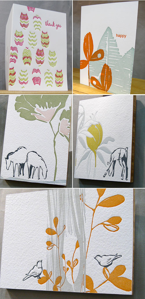
Studio Olivine

Invitations from Sweet Letter Press coming up in a future post, but I also have to show you their greeting cards — love the blind debossed pattern on the *star* = you card.
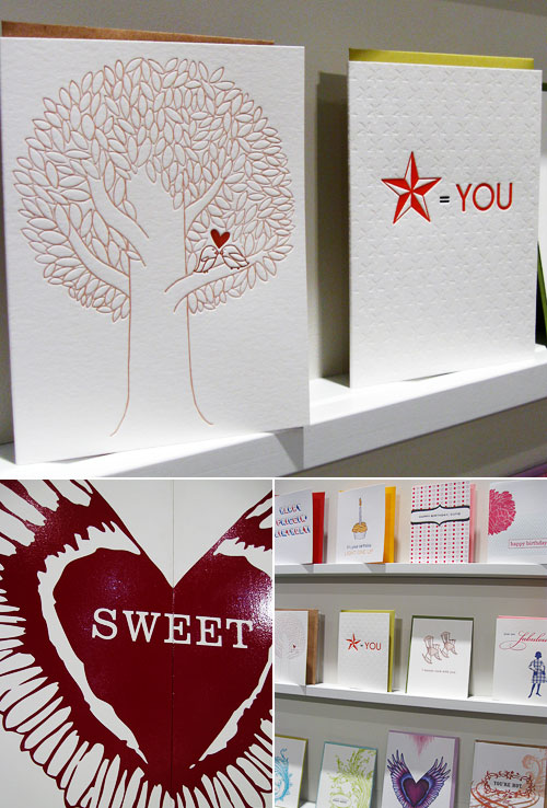
Sweet Letter Press

Check out this die cut, letterpress Grizzly Bear Hug card from Blackbird Letterpress, whose booth bunting was super cool, too. It looks like someone dressed him up for the show by giving him a little hat.
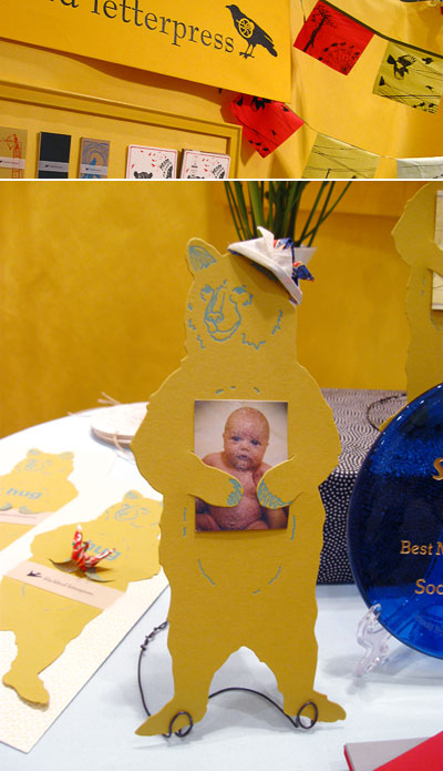
Blackbird Letterpress

Beautiful letterpress greetings by Red Oak Press. Love their use of color and texture:
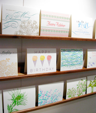
Red Oak Press

Loving the letterpress greeting cards and invites by Tiselle. Such a great variety, from elegant, flourish-filled birthday cards to cute scooter moving announcements:
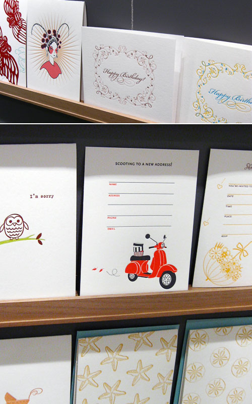
Tiselle

Really enjoyed the international flair and super cool, bright color palettes going on at Fine Day Press:
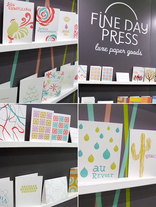
Fine Day Press

Oh so cute letterpress bunting cards and woodsy invitations at Flora & Fauna Press:
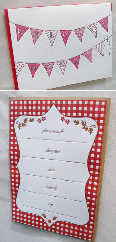
Flora & Fauna Press

Hoot, hoot! Adorable owly letterpress cards and invitations, and pretty woodland silhouettes at Lucky Bee Press:
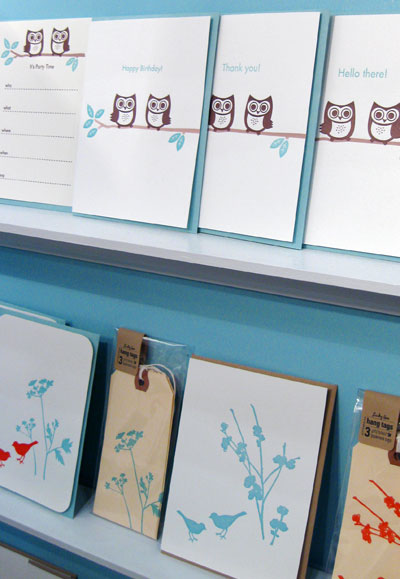
Lucky Bee Press

photos by yours truly

National Stationery Show 2010 : Greeting Cards Galore, Part 2

If you missed part one of my Greeting Cards Galore series, then you can find it right here. Now, onto part two!

Old Tom Foolery combined a great display, clever design, and their trademark humor in their lineup. Their new Typestache poster is a must have for typophiles, graphic designers, and mustache enthusiasts!

Old Tom Foolery

The Full Courtney Press made their debut at the stationery show this year, and I’m really digging the simplicity and clever use of type in their designs:

The Full Courtney Press

Loving all of the color in these vintage-inspired letterpress cards by Elum:

Elum Letterpress

There was such great energy at the Byrd & Bleecker booth. It was like a fashion show in there! I felt the urge to “work it”, but instead I took photos of their fabulous cards.

Byrd & Bleecker

9spotmonk has a great concept (and awesome neon colors) in their line of letterpress pop out art cards. It’s a card and a little piece of art, all rolled into one!

9spotmonk

The Pie Bird Press booth was filled to the brim with their oh so colorful cards. I can’t get enough of their layered illustration style — hello, chocolate bunny!

Pie Bird Press

The colorful fruit silhouettes in Hazel & Violet Ink’s Alice line really caught my eye:

Hazel & Violet Ink

Such sweet illustrations on the cards by The Great Lakes. Love that bunting card!

The Great Lakes

photos by yours truly

National Stationery Show 2010 : Greeting Cards Galore, Part 1

Are you ready for a fun-filled, greeting card adventure through the National Stationery Show? I sure hope so, because I have so many great greetings, note cards, stationery, and postcards to share.

If you’re looking for a great Father’s Day card, you should head on over to Hammerpress, which has some very cool options.

Hammerpress

I absolutely loved the texture of ink on these oh so pretty postcards from Igloo Press, and I had to hold myself back from squeeing out loud over the adorable recipe cards and tags, illustrated by Suzy Ultman.

Hammerpress

My photo does not do Sanna Annukka’s cards justice, but trust me, they were awesome!

Sanna Annukka

Seeing Albertine Press’ new Letterpress Library on display in person was fantastic. The patterns and color are so pretty that I couldn’t help but be drawn to the display.

Albertine Press Letterpress Library

And I was so happy to meet Angela Liguori, who was boothmates with Shelley from Albertine Press, and to see all of her gorgeous cotton ribbon and twine, as well as the new Francobolli Line from Carta Inc. What a colorful booth this was!

Angela Liguori

Lots of colorful eye candy at the enormouschampion booth, too, where I couldn’t take my eyes off of The Kingdom Animalia (top left). Their letterpress cards and prints are always standout, as well, alternating between a modern, graphic and vintage inspired aesthetic.

enormouschampion

A beautiful collection of cards from Masha D’Yans, whose colorful, dreamy painting style I really enjoy.

Masha D'Yans

Really cool, new Sweetheart cards from 175 Design Studio. I like the combination of ornate pattern with the cute, stylized “sweetheart” illustrations.

175 Design Studio

photos by yours truly

National Stationery Show 2010 : All About Details, Part 3

If you haven’t checked out the first two parts in the All About Details series, then you can find them here and here.

Kamal has such a unique line — I’m really digging the new chipboard invitations and cards, and I loved that she painted her booth a dark color to showcase her goods. Creating a garland using coasters from her collection was a brilliant idea, too.

Kamal

Erin and I met up with the lovely Carina of Crow & Canary at the Wild Pulp booth — by the way, you should check out Carina’s great coverage of the NSS if you aren’t already. Wild Pulp made their debut at the show this year, and I thought that the booth, which Christopher transported to the show in his pickup truck (!), fit so perfectly with the tone of the Wild Pulp collection. Can you believe that Christopher actually creates the bird nests for his cards by hand? Wow!

Wild Pulp

Jason & Ilira at Rag & Bone Bindery had a great display, which included an outfit with a paper skirt (textile top) that Ilira made the night before the show. That takes paper talent! I was also digging their oh so pretty guest books and liked that they had a project from Jason’s new book on display to hold their business cards.

Rag & Bone Bindery

Unfortunately, because I was so busy poring over Jason’s book, I managed to forget to take pictures of the rest of the booth. Hey, this was my first show, so I can be forgiven, right? Plus, it’s a really cool book! Thankfully, Jason was kind enough to send me some his photos so I can share them with you. Thanks, Jason!

Rag & Bone Bindery
Photo Credit: Jason Thompson

Walking into the Timeless Paper booth was like entering a magical paper world. I loved that Emily and her crew had all of the paper pretties on display just as they would be used at a wedding reception or party. So pretty.

Timeless Paper

The Paper Loop booth was so much fun! Their colorful, wonderfully illustrated cards brought lots of smiles, and I totally wanted to take the cute little bear that was on one wall of their booth with me. Somehow, I doubt that Sara and Rob would’ve been very happy about that.

Paper Loop

Such a pretty, woodland display of the Martha Stewart line at the Crane booth. Would you expect anything less from Martha?

Martha Stewart Crane

photos, with the exception of the ones taken by Jason Thompson, by yours truly

New Advertiser : Finch & Hawk Paper Goods

finch & hawk paper goods

It’s my pleasure to welcome Paper Crave’s newest advertiser, finch & hawk paper goods. Erin Vale is the talented designer behind the finch & hawk line, which includes snarky notepads — I use my Pain in the Groceries and Freakin’ To Do lists all the time — as well as customizable, printable and printed favor boxes, seed packets, and other details that are great for gift packaging, weddings, and parties. You can check out the entire finch & hawk shop right here.

images from finch & hawk paper goods