National Stationery Show 2010 : All About Details, Part 2

Miss the first part of All About Details? You can check it out here.

The Smock booth was a feast for the color lover’s eyes. I loved seeing the vibrant colorways in their new card collections, and the bent wire signage was something else — hello, mini smock hanger! Smock’s new gift boxes and bags are really cool, too, and their patterned boxes would make great office paper storage, as well as being fantastic as reusable gift boxes. And the gift bags — very sturdy and made from paper handmade in Nepal using 12th century papermaking techniques. Pretty neat stuff.
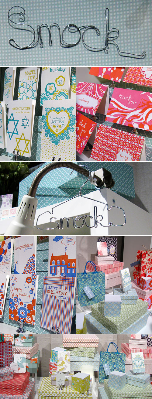
Smock

Wiley Valentine’s booth was like a super luxe lounge. I think they even had a couch in there! I really enjoyed their use of the birdcage wall hanging as a display for their cards and calendars, and their letterpress art prints were a feast for the eyes. Seriously, though, the “Let Them Eat Cake” print was making me hungry, and their oh so pretty recipe cards were making me want to bake. It must’ve been around lunch time when I visited their booth. Yep, that’s my excuse.
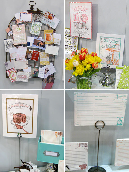
Wiley Valentine

The Mr. Boddington’s Studio booth made fantastic use of paper! From the white paper cobblestone walls to patterned envelope liner awnings, there was a little bit of paper in every corner, and it was a beautiful display for Mr. Boddington’s greetings. Plus, how cool is that post box business card holder?
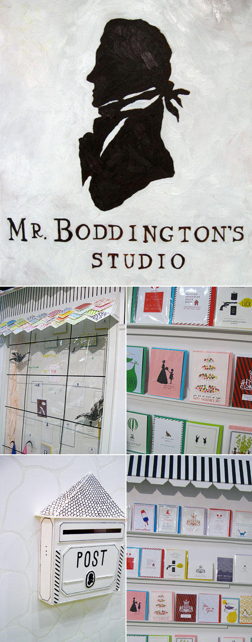
Mr. Boddington's Studio

Paisley Tree Press oh so cleverly used chicken wire as a display for their beautiful letterpress cards and coasters. Who knew that chicken wire could be so elegant?
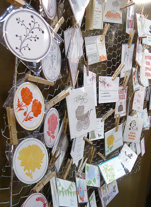
Paisley Tree Press

The hand cut wood sign at The Mincing Mockingbird was completely awesome, and I thought that the white on white in the booth made it look like a modern gallery space, perfect to display their bird paintings and prints. One of my favorites was the Pi is Infinitely Tasty card, perfect for the mathematician or pie lover in your life. Versatile!
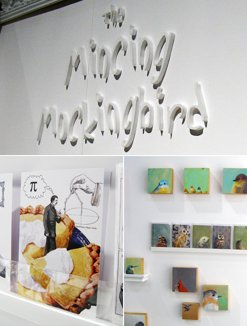
The Mincing Mockingbird

Lots of color and fun cards in the Amy Smyth Made It booth. Hee, Not Old Owl card! I thought it was neat that the back of the booth was covered with “framed” versions of a variety of the cards.
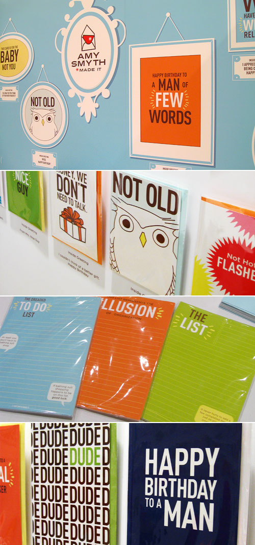
Amy Smyth Made It

photos by yours truly

National Stationery Show 2010 : All About Details, Part 1

One of the most exciting things about being at the stationery show was seeing all of the different booths. Walking into a shop’s booth was walking into a world that they’d constructed to house their creations, and I was amazed by so many of the booths and the work that was obviously put into them.

Blue Barnhouse rocked it with their awesome sign and wood plank walls!

Blue Barnhouse

One of my most anticipated booth visits was the Two Trick Pony booth. Laurie and Carrie had been posting in progress sneak peeks on Twitter leading up to the show, and I couldn’t wait to see everything in person. They created the perfect display for all of Two Trick Pony’s fun and colorful cards and invitations:

Two Trick Pony

Hot pink + handlettering + vintage postcards = awesome, which is what the Linda & Harriett booth, and their gorgeous letterpress calendars, was. Seeing their new calendar has become a yearly anticipation for me because it’s always filled with super cool illustrations, and their birthday calendar is great for people like me, who are a little absent-minded and need birthday reminders.

Linda & Harriett

I had so much fun in the Sugarcube Press booth. It was great to meet Kelsie and Elizabeth, the “sweet girly duo” behind Sugarcube, and their letterpress greetings were beautiful as well as clever. Plus, how cool are the vintage spoons used in their card display and the sugarcube covered cake stand used to hold their business cards?

Sugarcube Press

The a. favorite booth was truly an extension of their completely clever, vintage-inspired letterpress line of greetings. I loved that the cards were displayed on oversized “notebooks” (this theme was also carried through to the business cards — more on that later), and the retro-y goodie bags were the icing on the cake.

A. Favorite

photos by yours truly

National Stationery Show 2010 : World of Illustration, Part 2

Miss part one of the World of Illustration? You can check it out right here.

Oh so cutie patootie new letterpress and wood veneer cards from Night Owl Paper Goods. How adorable is the little watermelon?!

Night Owl Paper Goods

Egg Press has a style all their own, and I always look forward to seeing what they’ll come up with next. Their new die-cut double decker bus and finger puppet cards and prints are so much fun!

Egg Press

Urubbu was a booth that wasn’t originally on my list, but I’m so glad that Erin and I stopped in because it was fantastic. Though not technically illustrated, these cards are so very unique. I still can’t get over that the original collages used to create the cards and prints are made, for the most part, from recycled magazine pages:

Urubbu

Red Cap Cards has been one of my favorites since before I started Paper Crave, and it was wonderful to finally meet Carrie Gifford and to see so much of the Red Cap line, which now also includes cards from illustrators like Blanca Gomez, Anke Weckmann, and Jon Klassen.

Red Cap Cards

photos by yours truly

National Stationery Show 2010 : World of Illustration, Part 1

I have a soft spot for great illustration, and there was no shortage of fantastic illustrated greeting cards and stationery at this year’s stationery show. From the wonderfully fun creations of Brad Woods (Maginating Letterpress + Design) to Carolyn Gavin’s (Ecojot) illustrated notebooks for a great cause, there was so much to see.

The Maginating Letterpress + Design booth was so much fun. Even the grumpy clouds made me smile, and the From the Tools card is perfect for Father’s Day, which will be here before we know it:

Maginating Letterpress + Design

Lots of buzz about the Rifle Paper Co. booth, and with good reason. Anna Bond’s illustrated cards and invitations are absolutely beautiful. She really takes it to the next level, and I cannot wait until her line of personalized wedding and event invitation templates launches later this year.

Anna Bond Rifle Paper Co.

And these recipe boxes, made from reclaimed wood, plus coordinating recipe cards would make fantastic gifts. Plus, a calendar! Can’t wait until that’s released later this year.

Anna Bond Rifle Paper Co.

I cannot get enough of Cindy Tomczyk’s whimsical illustrations, and I had so much fun in the Let {her} Press booth, of which Paper Parasol, Cindy’s greeting card and stationery shop, was a part. A little more from Cindy later, but here’s a peek at her all occasion line:

Cindy Tomczyk Paper Parasol

Pie! Seriously, I’m gobbling up this print from Old School Stationers as soon as I spot it in their shop. They’ve really tapped into the do-it-yourself/back to the land zeitgeist with their In the Kitchen line, which features prints and letterpress cards in four designs:

Old School Stationers

Ecojot debuted a new line of notebooks, illustrated by Carolyn Gavin, at the stationery show. The line represents a new partnership with Jane Goodall, and a royalty from the purchase of each of the new wildlife notebooks will be given to the Jane Goodall Institute to help conserve an endangered species.

Ecojot Carolyn Gavin

photos by yours truly

National Stationery Show 2010 : Overview

Envelopments

This year was my first at the National Stationery Show, and what a whirlwind it was! My NSS buddy, Erin Vale, and I had an absolute blast, and I was so happy to finally be able to meet so many of the talented paper gals and guys whose work I admire. I seriously felt like, for the two days I was there, I was walking around a huge eye candy store for paper lovers. Above: a rainbow of paper from the Envelopments booth.

It’s wonderful to check out paper goods online, and thank goodness for the internet because I don’t know what I’d do without my daily dose of pretty paper, but it’s even better to see high quality paper goods up close and personal, where you can feel the texture of the paper, run your fingers over the impressions (if it’s letterpress), and have the tactile experience that you can’t get online. I was so jazzed to see:

Monsieur Boudin

Monsieur Boudin! I’ve been completely enamored with this collection, illustrated by Labpartners, since it came out, and seeing it in person at the Vigo booth was fantastic.

Sycamore Street Press

Sycamore Street Press’ letterpress cards on display. Doesn’t the collection look lovely all together like this?

Hello Hanna

Fun, oh so whimsical, three dimensional Wishing Trees from Hello Hanna (available in July). These will be perfect for centerpieces at weddings, showers, birthdays, and other special days. I can definitely see why these won the NSS’s Best New Product award in the Party category.

Red Oak Press

Loved seeing Red Oak Press’ line in person, especially the William Morris letterpress cards (second shelf), which are even more beautiful in person. And their new Dog Wisdom line (third shelf) is so much fun.

Pomsicles by Cat Seto

Pomsicles from Cat Seto! Seriously, these are so cute, and I think that having a fuzzy pom pencil topper would make taking tests and writing grocery and to do list so much more fun.

Hello! Lucky Letterpress Cards

Just a few of the new letterpress cards from Hello! Lucky, including Sock Monkey Sam cards and mermaid and unicorn cards, illustrated by Julia Rothman.

images by yours truly