National Stationery Show 2010 : Greeting Cards Galore, Part 1

Are you ready for a fun-filled, greeting card adventure through the National Stationery Show? I sure hope so, because I have so many great greetings, note cards, stationery, and postcards to share.

If you’re looking for a great Father’s Day card, you should head on over to Hammerpress, which has some very cool options.
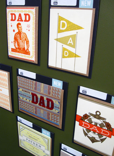
Hammerpress

I absolutely loved the texture of ink on these oh so pretty postcards from Igloo Press, and I had to hold myself back from squeeing out loud over the adorable recipe cards and tags, illustrated by Suzy Ultman.
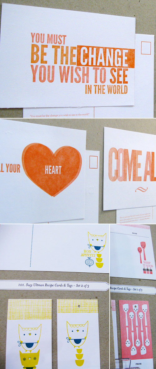
Hammerpress

My photo does not do Sanna Annukka’s cards justice, but trust me, they were awesome!
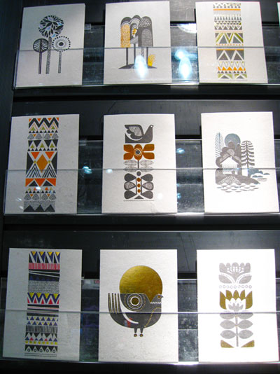
Sanna Annukka

Seeing Albertine Press’ new Letterpress Library on display in person was fantastic. The patterns and color are so pretty that I couldn’t help but be drawn to the display.
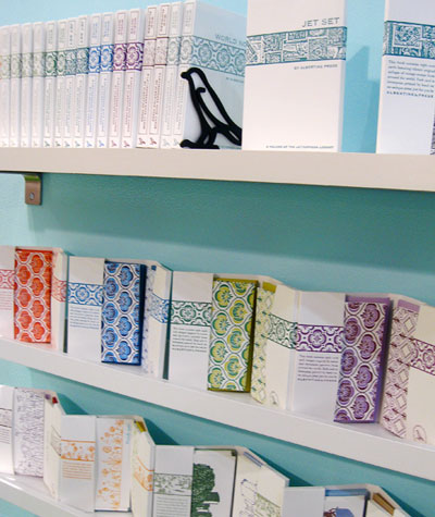
Albertine Press Letterpress Library

And I was so happy to meet Angela Liguori, who was boothmates with Shelley from Albertine Press, and to see all of her gorgeous cotton ribbon and twine, as well as the new Francobolli Line from Carta Inc. What a colorful booth this was!
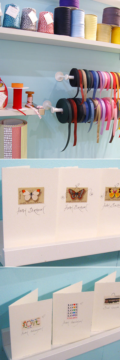
Angela Liguori

Lots of colorful eye candy at the enormouschampion booth, too, where I couldn’t take my eyes off of The Kingdom Animalia (top left). Their letterpress cards and prints are always standout, as well, alternating between a modern, graphic and vintage inspired aesthetic.
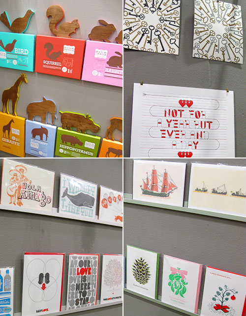
enormouschampion

A beautiful collection of cards from Masha D’Yans, whose colorful, dreamy painting style I really enjoy.
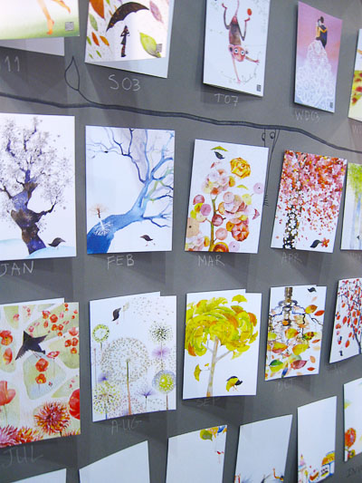
Masha D'Yans

Really cool, new Sweetheart cards from 175 Design Studio. I like the combination of ornate pattern with the cute, stylized “sweetheart” illustrations.
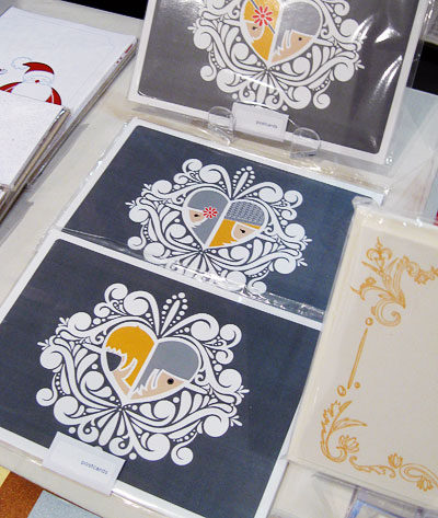
175 Design Studio

photos by yours truly

National Stationery Show 2010 : All About Details, Part 3

If you haven’t checked out the first two parts in the All About Details series, then you can find them here and here.

Kamal has such a unique line — I’m really digging the new chipboard invitations and cards, and I loved that she painted her booth a dark color to showcase her goods. Creating a garland using coasters from her collection was a brilliant idea, too.

Kamal

Erin and I met up with the lovely Carina of Crow & Canary at the Wild Pulp booth — by the way, you should check out Carina’s great coverage of the NSS if you aren’t already. Wild Pulp made their debut at the show this year, and I thought that the booth, which Christopher transported to the show in his pickup truck (!), fit so perfectly with the tone of the Wild Pulp collection. Can you believe that Christopher actually creates the bird nests for his cards by hand? Wow!

Wild Pulp

Jason & Ilira at Rag & Bone Bindery had a great display, which included an outfit with a paper skirt (textile top) that Ilira made the night before the show. That takes paper talent! I was also digging their oh so pretty guest books and liked that they had a project from Jason’s new book on display to hold their business cards.

Rag & Bone Bindery

Unfortunately, because I was so busy poring over Jason’s book, I managed to forget to take pictures of the rest of the booth. Hey, this was my first show, so I can be forgiven, right? Plus, it’s a really cool book! Thankfully, Jason was kind enough to send me some his photos so I can share them with you. Thanks, Jason!

Rag & Bone Bindery
Photo Credit: Jason Thompson

Walking into the Timeless Paper booth was like entering a magical paper world. I loved that Emily and her crew had all of the paper pretties on display just as they would be used at a wedding reception or party. So pretty.

Timeless Paper

The Paper Loop booth was so much fun! Their colorful, wonderfully illustrated cards brought lots of smiles, and I totally wanted to take the cute little bear that was on one wall of their booth with me. Somehow, I doubt that Sara and Rob would’ve been very happy about that.

Paper Loop

Such a pretty, woodland display of the Martha Stewart line at the Crane booth. Would you expect anything less from Martha?

Martha Stewart Crane

photos, with the exception of the ones taken by Jason Thompson, by yours truly

National Stationery Show 2010 : All About Details, Part 2

Miss the first part of All About Details? You can check it out here.

The Smock booth was a feast for the color lover’s eyes. I loved seeing the vibrant colorways in their new card collections, and the bent wire signage was something else — hello, mini smock hanger! Smock’s new gift boxes and bags are really cool, too, and their patterned boxes would make great office paper storage, as well as being fantastic as reusable gift boxes. And the gift bags — very sturdy and made from paper handmade in Nepal using 12th century papermaking techniques. Pretty neat stuff.

Smock

Wiley Valentine’s booth was like a super luxe lounge. I think they even had a couch in there! I really enjoyed their use of the birdcage wall hanging as a display for their cards and calendars, and their letterpress art prints were a feast for the eyes. Seriously, though, the “Let Them Eat Cake” print was making me hungry, and their oh so pretty recipe cards were making me want to bake. It must’ve been around lunch time when I visited their booth. Yep, that’s my excuse.

Wiley Valentine

The Mr. Boddington’s Studio booth made fantastic use of paper! From the white paper cobblestone walls to patterned envelope liner awnings, there was a little bit of paper in every corner, and it was a beautiful display for Mr. Boddington’s greetings. Plus, how cool is that post box business card holder?

Mr. Boddington's Studio

Paisley Tree Press oh so cleverly used chicken wire as a display for their beautiful letterpress cards and coasters. Who knew that chicken wire could be so elegant?

Paisley Tree Press

The hand cut wood sign at The Mincing Mockingbird was completely awesome, and I thought that the white on white in the booth made it look like a modern gallery space, perfect to display their bird paintings and prints. One of my favorites was the Pi is Infinitely Tasty card, perfect for the mathematician or pie lover in your life. Versatile!

The Mincing Mockingbird

Lots of color and fun cards in the Amy Smyth Made It booth. Hee, Not Old Owl card! I thought it was neat that the back of the booth was covered with “framed” versions of a variety of the cards.

Amy Smyth Made It

photos by yours truly

National Stationery Show 2010 : All About Details, Part 1

One of the most exciting things about being at the stationery show was seeing all of the different booths. Walking into a shop’s booth was walking into a world that they’d constructed to house their creations, and I was amazed by so many of the booths and the work that was obviously put into them.

Blue Barnhouse rocked it with their awesome sign and wood plank walls!

Blue Barnhouse

One of my most anticipated booth visits was the Two Trick Pony booth. Laurie and Carrie had been posting in progress sneak peeks on Twitter leading up to the show, and I couldn’t wait to see everything in person. They created the perfect display for all of Two Trick Pony’s fun and colorful cards and invitations:

Two Trick Pony

Hot pink + handlettering + vintage postcards = awesome, which is what the Linda & Harriett booth, and their gorgeous letterpress calendars, was. Seeing their new calendar has become a yearly anticipation for me because it’s always filled with super cool illustrations, and their birthday calendar is great for people like me, who are a little absent-minded and need birthday reminders.

Linda & Harriett

I had so much fun in the Sugarcube Press booth. It was great to meet Kelsie and Elizabeth, the “sweet girly duo” behind Sugarcube, and their letterpress greetings were beautiful as well as clever. Plus, how cool are the vintage spoons used in their card display and the sugarcube covered cake stand used to hold their business cards?

Sugarcube Press

The a. favorite booth was truly an extension of their completely clever, vintage-inspired letterpress line of greetings. I loved that the cards were displayed on oversized “notebooks” (this theme was also carried through to the business cards — more on that later), and the retro-y goodie bags were the icing on the cake.

A. Favorite

photos by yours truly

National Stationery Show 2010 : World of Illustration, Part 2

Miss part one of the World of Illustration? You can check it out right here.

Oh so cutie patootie new letterpress and wood veneer cards from Night Owl Paper Goods. How adorable is the little watermelon?!

Night Owl Paper Goods

Egg Press has a style all their own, and I always look forward to seeing what they’ll come up with next. Their new die-cut double decker bus and finger puppet cards and prints are so much fun!

Egg Press

Urubbu was a booth that wasn’t originally on my list, but I’m so glad that Erin and I stopped in because it was fantastic. Though not technically illustrated, these cards are so very unique. I still can’t get over that the original collages used to create the cards and prints are made, for the most part, from recycled magazine pages:

Urubbu

Red Cap Cards has been one of my favorites since before I started Paper Crave, and it was wonderful to finally meet Carrie Gifford and to see so much of the Red Cap line, which now also includes cards from illustrators like Blanca Gomez, Anke Weckmann, and Jon Klassen.

Red Cap Cards

photos by yours truly