I’m absolutely loving the mix of awesome typography and vintage style illustrations in Kirtland House’s line of letterpress holiday cards. The pale seafoam shade of ink that plays a prominent role in several of the designs is one of my new favorite things, or maybe it’s that fantastic typography? Either way, these are some truly lovely cards:
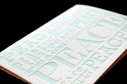
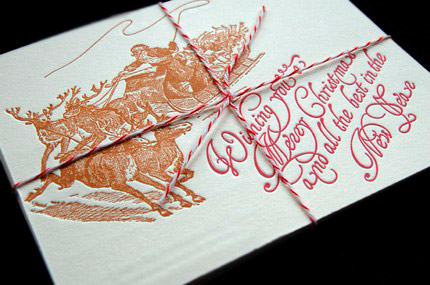
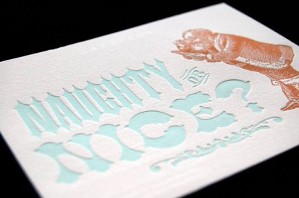
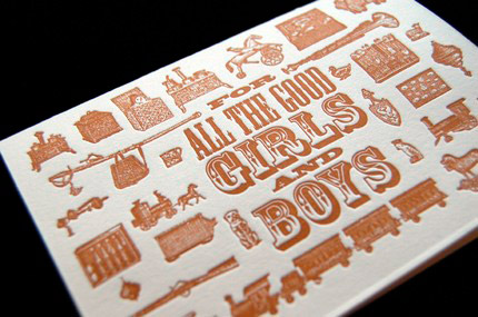
images from Kirtland House


